Category: Print

This is the section of my site where all print collateral portfolio samples reside. I have created a wide variety of print collateral from business cards to product brochures to proposals.

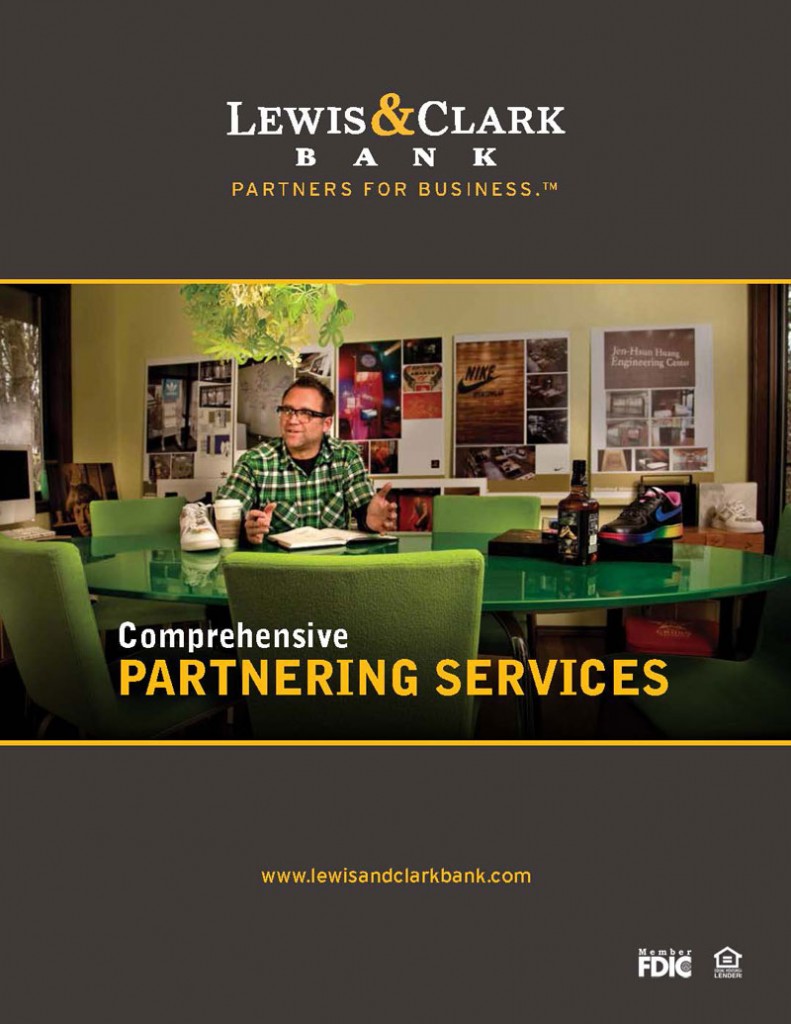
Lewis & Clark Bank Brochure

Client: Lewis & Clark Bank

Challenge: To create one piece of printed material that would encapsulate all the offered services of Lewis & Clark Bank. The bank had recently rebranded and wanted a piece that would compliment the new brand but stand a lone as an informative piece of literature.

Solution: I met with the marketing manager of Lewis & Clark Bank several times to decide what information needed to be featured in this piece. Once the content had been decided, the form was then decided to be a familiar 11×17 single fold saddle stitched booklet. I took the required information and created a grid to ensure that the content would be displayed consistently. Styles were created to ensure consistency as well. I used the brand to frame the content in an elegant and attractive way so as to not distract from the content but to compliment it. The client was very happy with the piece and decided to use it as an in house training tool for employees. I have worked with Lewis & Clark on several different projects since.

 

Continue reading “Lewis & Clark Bank Brochure”

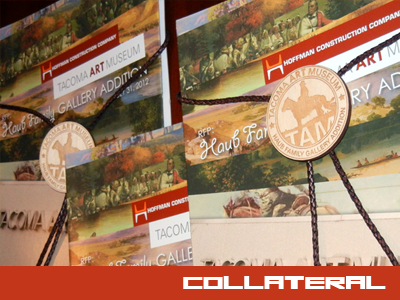
Tacoma Art Museum RFP (Request For Proposal)

Client: Hoffman Construction Company

Challenge: Design a proposal that focuses on the Western art style which correlates to a new addition being added to the Tacoma Art Museum. The proposal design also needed to tie back to the RFQ (Request for Qualifications) phase for this same project but have its own style and character.

Solution: I featured Western art on the front cover in a unique and interesting way hinting at the modern style of the museum itself. I chose a color scheme that represented this style of art. The presentation of the art was a derivative of the RFQ. Bands of angled shapes captured the art in “slivers” that hint at the bold color bands of the RFQ. The back cover of the book is identicle except for the color. The bands of color were replaced by bands of varying tones of orange and brown. This theme was very well accepted by the client. Hoffman was chosen for the interview round for this project in which this same style was utilized to continue a cohesive message.

Continue reading “Tacoma Art Museum RFP (Request For Proposal)”

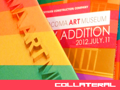
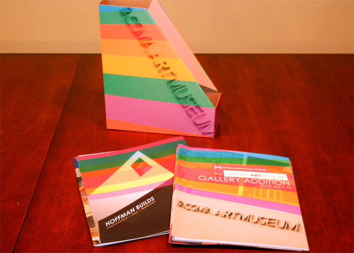
Tacoma Art Museum Proposal

Client: Hoffman Construction Company

Challenge: To create an engaging multifacited piece of information art. The book needed to be functional as a proposal but every aspect of the book needed to represent high end art. The book itself needed to be art. The reader should get the feeling that they are holding a high end piece of art.

Result: I designed the piece to be eye-catching. The bold color pallet cannot be ignored. It almost screams to be picked up and read. The colors are used throughout the book to keep the reader engaged. Big, bright colorful pictures were used to emphasize the focus on high end art. The book was very well received and Hoffman was scored the highest of all submitted proposals. The Hoffman team was invited to participate in the next phase of the proposal process.


Continue reading “Tacoma Art Museum Proposal”

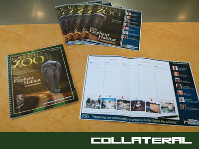
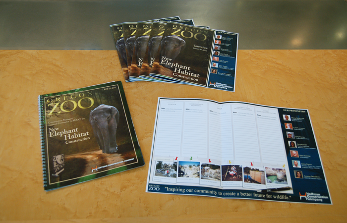
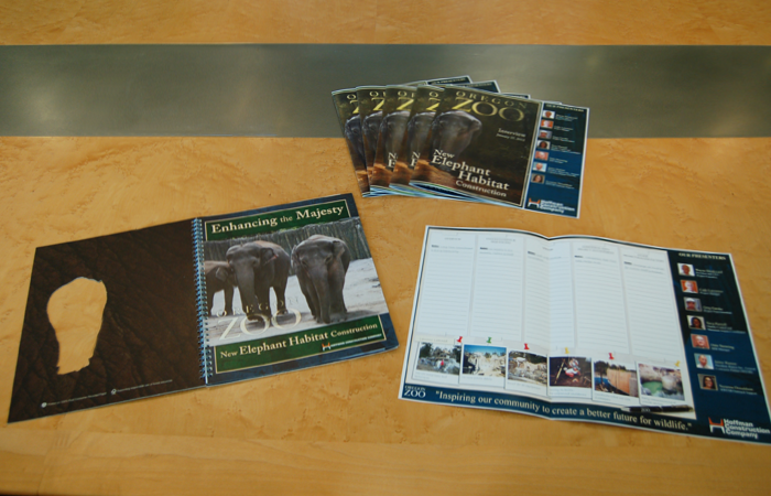
Oregon Zoo Proposal

Client: Hoffman Construction Company

Challenge: I needed to create a collection of collateral pieces that captured the majesty of the Oregon Zoo African Elephants. The pieces needed to showcase the elephant as an important part of conservation and enjoyment by zoo visitors.

Result: The piece was very well accepted. Many people have commented on how different and fresh the design is and how incorporating the cut out made it stand apart form the rest. Hoffman received an interview and lind words form their client on all of the collateral pieces that accompanied their interview.


Continue reading “Oregon Zoo Proposal”

Xerox Quarterly Kits

Client: Xerox

Challenge: Xerox creates quarterly sales material kits to send to the sales staff. Each quarter needed to have a distinct feel to it but still represent Xerox. Each month different products were featured as the product to sell. These products became the focus of the kit theme. If the feature products were small office color machines, the speed and low cost of the products was the feature.

Result: I created a theme for the envelope which housed all the sales materials. This theme carried over to all of the print material that was specific to the quarterly promotion. The sales of the featured products rose considerably. Also, the production of other sales materials increased as a result of these quarterly kits.


Continue reading “Xerox Quarterly Kits”

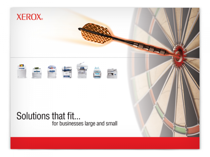
Xerox Product Brochure

At Xerox, I created many pieces of collateral in support of Xerox products. One of these pieces was a product brochure. This was a short but informative brochure about a product that could be used by sales people to promote the features of a product.

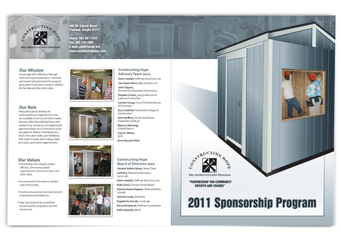
Constructing Hope Flyer

Hoffman Construction has several subsidiary companies. Hoffman Structures is one such company. Volunteer work is important to Hoffman. I designed this brochure to help with fundraising efforts for the Constructing Hope program in Portland. This gave me an opportunity to contribute to a good cause, helping people to gain new skills to improve their career opportunities.

Continue reading “Constructing Hope Flyer”