Lynch Mechanical is a well established mechanical piping contractor. They services multiple industries, many of which are commercial. Lynch was a part of a larger brand before being purchased from an independent owner. The new owner, now not affiliated with the Lynch brand, wanted a new identity for Lynch Mechanical that no longer resembled the Lynch umbrella company that it once belonged too.
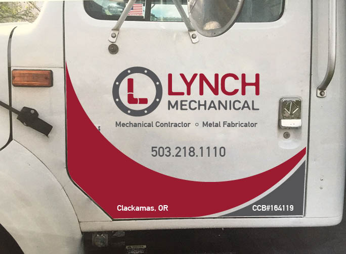
Being rooted in the industrial and mechanical industry, Lynch Mechanical needed to connect itself visually to its products and services. The “L” shape represents a segmented pipe. The circle around it represents the connecting ring at the end of of a pipe segment. Using these simple elements shows the viewer at a glance what Lynch Mechanical is about.
The color scheme was chosen to differentiate Lynch Mechanical from its competitors in the industry. Many companies in the industrial services industry choose blue as a primary color for their identity. Choosing red differentiates Lynch. The tone of the red and gray are very similar as to not have one color override the other. The two colors are very much in harmony.
The client was very happy with the look of this logo. Two options were created as to give the client maximum flexibility when using the logo for their businesses purposes. Since the inception of the logo, Lynch has contracted Harris Design House to design business cards, letter head, email signature, envelopes. HDH has also designed a design for Lynch Mechanical service trucks. This design stands out with the use of bold colors and curved lines that are customized to fit the doors of the work trucks.
