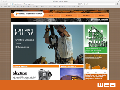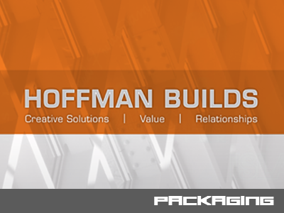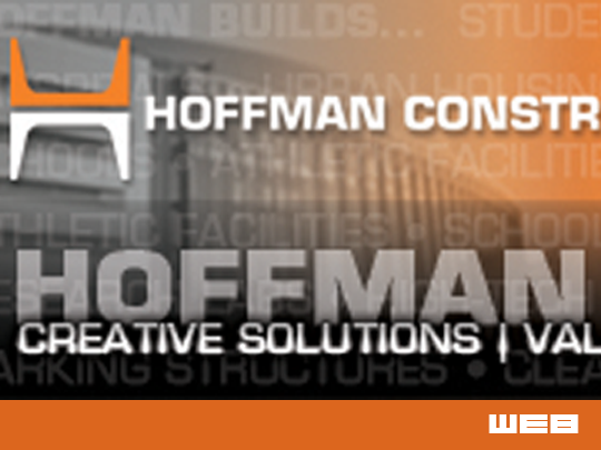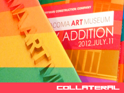
Client: Hoffman Construction Company
Challenge: To create an engaging multifacited piece of information art. The book needed to be functional as a proposal but every aspect of the book needed to represent high end art. The book itself needed to be art. The reader should get the feeling that they are holding a high end piece of art.
Result: I designed the piece to be eye-catching. The bold color pallet cannot be ignored. It almost screams to be picked up and read. The colors are used throughout the book to keep the reader engaged. Big, bright colorful pictures were used to emphasize the focus on high end art. The book was very well received and Hoffman was scored the highest of all submitted proposals. The Hoffman team was invited to participate in the next phase of the proposal process.